The thing that was most difficult for me as an R beginner was plotting graphs with error bars – there is no concise way to do this with base graphics. There are workarounds, often using the ‘arrows’ command, but isn’t there a simpler way?
Yes, in fact there are a handful of plotting packages for R: the two leaders being ggplot2 and lattice. Both have their advantages and disadvantages; one advantage of ggplot2 is that it seems to be more widely used and as a result there is more documentation available for it on the net. This tutorial will therefore use ggplot2.
What you’ll learn:
- How to install and load new packages in R-Studio.
- How to use ggplot2 to make the three types of graphs I make most frequently that cannot be easily made with base graphics: a dodged histogram, a barplot with error bars, and a scatter plot with error bars.
Installing and using new packages
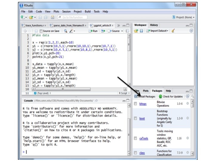
A ‘package’ is R-lingo for a cohesive set of functions and objects that someone else has made and is available to the community. There are packages for many things besides plotting, such as advanced statistics packages (e.g. lmer), packages for dealing with big genomics datasets (Bioconductor), and many more. To install a package in R using R-studio, go to the packages tab and click on install packages:
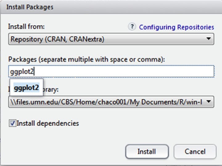
Then type the package name into the text box, and hit ‘install,’ making sure that ‘install dependencies’ is clicked. Note that if this is the first use, it may ask you to choose a location. Pick somewhere geographically near to you.
The package will now install automatically. You may see some warnings about the package being made for an earlier version of R, but usually this does not affect functionality.
Finally, to use a package, you need to add the package to the ’library’ of functions that R knows how to use. You do this with the function library():
library(ggplot2)
(In these articles, commands to enter are bolded and what you see in the command window is indicated in blue text). You need to run this function each time you start a new R session. I usually put commands to load packages at the top of my R scripts.
Using ggplot
To best use ggplot, you need to understand a few things first:
- ggplot wants your data in ‘long’ format (meaning each observation gets its own row).
- Except for histograms, ggplot works best on pre-summarized data (meaning you have already calculated means and standard deviations / errors).
Here, I’ll make up some data and put it in a format to use for histograms. Then I’ll show you how to summarize the data and put it into a format to use for barplots with error bars. Finally I’ll show you a tiny tweak to the code to let you make a scatterplot with error bars.
Making fake data and putting it in long format for dodged histograms
The code below is made up data from an experiment in which we measured fluorescence in cells that were either drug-treated or not (control). The fluorescence values are normally-distributed random numbers with different means.
#Histogram data: measuring cell fluorescence in a drug treatment and control
trt = rnorm(30,2,1) #generate 30 random numbers from a normal distribution with mean 2 and sd 1
cntrl = rnorm(30,4,1)
fluorescence = c(trt,cntrl) #in long format, all the response data is in one vector
treatment = c(rep(‘+ drug’,30),rep(‘control’,30))
#put the data together into a data.frame, which ggplot prefers
my_df = data.frame(treatment,fluorescence)
I concatenated the response variables and made a treatment variable of equal length, then put these data into a data.frame for use with ggplot. Click on my_df in the workspace if you want to see a spreadsheet view of it.
To use ggplot, you first need to tell it where your data is, and what you want on the x- and y-axes, then you can tell it what kind of plot you want. This is cool because you can swap out different plot types (called ‘geoms’ in ggplot) and see which way expresses your data the best.
You almost always start along these lines:
my_plot = ggplot(my_df,aes(x=fluorescence))
Here we created a variable called ‘my_plot’ and in it put a ggplot object. This ggplot object was initialized by telling it where the data is (my_df), and then also telling it what ‘aesthetics’ to use (aes). Aesthetics can be interpreted as the x- and y- variables as well as any groupings, if for example you want to color by a different grouping than you assigned to x or y.
Since we’re starting with a histogram, we only have an x variable (the y variable is counts or frequencies in a histogram).
If you entered my_plot into the command window now you’d get an error saying there are no layers in plot, because we haven’t yet added any geoms. Let’s add a histogram geom and see what happens:
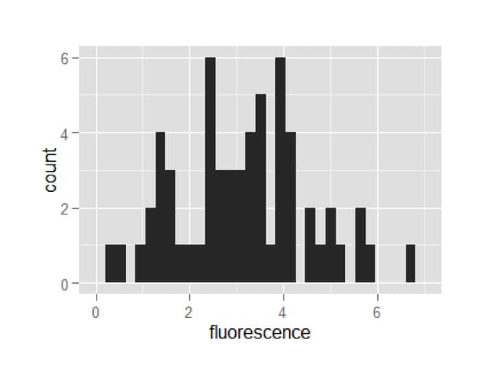
my_plot = my_plot + geom_histogram()
my_plot
A plot appears!
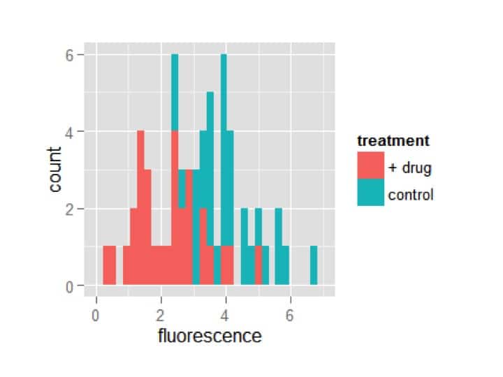
However, it hasn’t split the data by the group. Let’s start over and add the aesthetic of fill to the ggplot, and tell it we want it to adjust the fill by treatment.
my_plot = ggplot(my_df,aes(x=fluorescence,fill=treatment))
my_plot = my_plot + geom_histogram()
my_plot
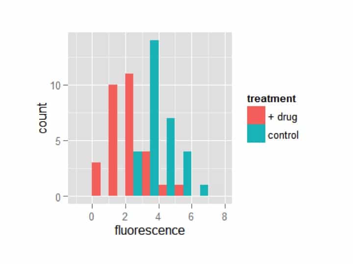
Awesome! Now the treatments are automatically separated by fill color. However, it is plotting one treatment on top of the other. You may want it this way, but I prefer to see the bars dodged (i.e. offset). Additionally, I think too many bins are being shown. ggplot lets you specify exactly how wide you want each bin; I’m going to choose a width of 1.
my_plot = ggplot(my_df,aes(x=fluorescence,fill=treatment))
my_plot = my_plot + geom_histogram(position=’dodge’,binwidth=1)
my_plot
Not bad for three lines of code!
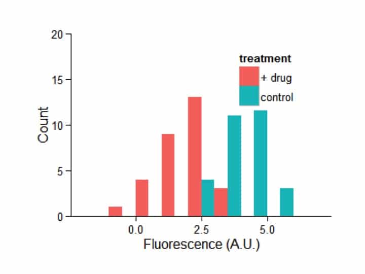
Now I’m going to ‘pretty it up’ in one big fell swoop. I recommend going through line-by-line and adding one piece at a time to see what each do.
my_plot = ggplot(my_df,aes(x=fluorescence,fill=treatment))
my_plot = my_plot + geom_histogram(position=’dodge’,binwidth=1)+
theme_bw()+
scale_y_continuous(‘Count’,limits=c(0,20),expand=c(0,0))+
scale_x_continuous(‘Fluorescence (A.U.)’)+
theme(legend.position=c(0.75,0.75))+
theme(axis.line = element_line(colour = “black”))+
theme(panel.grid.major = element_blank())+
theme(panel.grid.minor = element_blank())+
theme(panel.border = element_blank())+
theme(panel.background = element_blank())
my_plot
Swapping geoms
Remember how I said you can easily ‘swap out’ different geoms to see how they look? Here’s an example of that.
my_plot = ggplot(my_df,aes(x=treatment,y=fluorescence))
my_plot + geom_point() # run this and lower lines separately
my_plot + geom_boxplot()
my_plot + geom_jitter()
my_plot + geom_violin()
I’ve changed the aesthetics so that the x axis is treatment and the y axis is fluorescence. Then, without saving as variables, I’m viewing the ggplot with different geoms to see how they appear:
I promised bar plots and scatter plots with error bars, right? OK. First we have to summarize the data. To do that, we’re going to use some of my favorite R tools – the apply functions. The apply functions take in some data, a factor, and a function, and apply the function to the data after separating the data by the factor.
Here, we have fluorescence data. We want to apply a mean (as in average) function to the data, but only after separating the data by treatment. Also, our data is in a table-like form (a data.frame), so we’ll use the tapply() function. Below I’ve done that to generate the means and standard deviations by treatment, then found out the treatment levels that correspond to the data generated by tapply, then put it all together into a new data.frame.
my_means = tapply(my_df$fluorescence, my_df$treatment, mean)
my_sd = tapply(my_df$fluorescence, my_df$treatment, sd)
trts = levels(my_df$treatment)
summary_df = data.frame(fluorescence=my_means, fluor_sd = my_sd, treatment = trts)
You can put any function that can be applied to numeric data in as the function part of tapply(),or even make your own. It is incredibly useful!
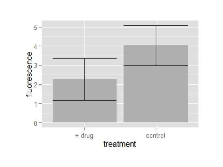
Now we can make a ggplot object with the summary data, and use it to easily make our plots:
my_plot = ggplot(summary_df,aes(x=treatment,y=fluorescence))
my_plot = my_plot+geom_bar(stat=’identity’,fill=’grey’)
my_plot = my_plot+geom_errorbar(aes(ymin=fluorescence-fluor_sd,ymax=fluorescence+fluor_sd))
my_plot
We used two geoms to generate the bar plot with error bars: one for the bars and one for the error bars. A quirk of making barplots with ggplot is that if you want the bars to be at the actual data’s height, you need to tell it to use the stat ‘identity’.
The other thing to notice is that we had to define more aesthetics in the geom error bar. This is because it needs to know two locations – the top (ymax) and the bottom (ymin) of each error bar. If you spend some time searching ggplot’s documentation (and I suggest you do), you’ll see which geoms require more aesthetics and why.
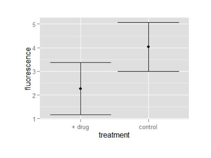
Finally, a scatter plot with error bars, which uses almost identical code to above:
my_plot = ggplot(summary_df,aes(x=treatment,y=fluorescence))
my_plot = my_plot+geom_point()
my_plot = my_plot+geom_errorbar(aes(ymin=fluorescence-fluor_sd,ymax=fluorescence+fluor_sd))
my_plot
OK, this isn’t technically a scatter plot, because the x-axis doesn’t have continuous values, but making a true scatter plot would use identical code and I figured it was easier to keep using the data we had been using.
Of course, all these plots can be ‘prettified’ just like I did to the histogram, and often by just copying and pasting the exact code. This makes graphical reproduction very smooth, and having the graphics coded into script (rather than a hopefully-remembered series of steps in Excel) means you’ll never have to worry about forgetting how to do things.
Hope you enjoyed this tutorial!
You made it to the end—nice work! If you’re the kind of scientist who likes figuring things out without wasting half a day on trial and error, you’ll love our newsletter. Get 3 quick reads a week, packed with hard-won lab wisdom. Join FREE here.

