To pull together our discussions so far on hypothesis testing and p-values, we will use the t distribution as an example to see how it all works. The t distribution (you may have heard it called Student’s t) is a probability distribution that looks like a bell-shaped curve (or normal distribution).
If we sample repeatedly from a population in which the null hypothesis is true, the t distribution shows the long-run probabilities of various t values occurring.
But what is a t value?
We calculate a t statistic from our data set. Here’s the calculation for testing a sample mean:

If the null hypothesis is true, the sample mean would likely be close to the hypothesised value (e.g. the sample mean could equal 52, close to the hypothesised mean of 50). This would leave us with a numerator (above the line) close to zero, which in turn gives a t statistic close to zero.

Whereas, if our sample mean is further away from the hypothesised mean (e.g. 63) the resulting t statistic would be larger.

We then look to see where our calculated t statistic lies on the t distribution. Because it is a bell-shaped curve, the data clusters about the mean. Values further away from the mean (i.e. toward the tails of the distribution) are not impossible if the null hypothesis is true, but they are unlikely.
Statistical tables for the t distribution are readily available online and in textbooks. They give us critical values for the t distribution at various levels of significance. For instance, here is the alpha = 0.05 table we looked at when discussing degrees of freedom.
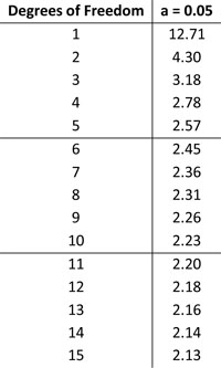
The underlying distribution is identical in the various tables; they vary only in what percentage of the distribution is being shown. Our table tells us, for a given degree of freedom, what value does 5% of the distribution lie beyond. For example, when df = 5, the critical value is 2.57. That means 5% of the data lies beyond 2.57 – so if our calculated t statistic is equal to or greater than 2.57, we can reject our null hypothesis.
At this stage we tie back into p-values. Often p-values are presented as some magical number, with researchers perhaps unsure where they actually came from. Here’s the secret: there’s nothing magic about them. As we’ve already discussed, p-values tell us the probability of obtaining our t statistic, or one more extreme, given the null hypothesis is true. That is, what area of the t distribution lies beyond our calculated t statistic?
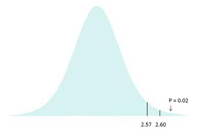
We’ve already worked out that for 5 degrees of freedom, the critical t value is 2.57; 5% of the distribution lies to the right of the line marking 2.57. As shown above, if our sample mean was 63 we get a calculated t statistic of 2.60. The area to the right of this line gives us our p-value; the probability of getting this or more extreme, i.e. what area of the distribution lies to the right of 2.60. In this case, the answer is 2% of the distribution, giving us a p-value of 0.02. This is that magic number that your statistics software spits out; hopefully it doesn’t seem so magical now.
Next up: using all this information to start working through some statistical examples! In the meantime, post your comments below on how you’re finding the stats series so far and what you’d like me to write about next.
You made it to the end—nice work! If you’re the kind of scientist who likes figuring things out without wasting half a day on trial and error, you’ll love our newsletter. Get 3 quick reads a week, packed with hard-won lab wisdom. Join FREE here.
Put this article into practice
Choose a free resource to help you move forward
CHEAT SHEET
Lab Math Cheat Sheet
DIGITAL TOOL
Lab Math Calculator


