As you’ve probably kind of guessed from our previous articles Introducng R and the Basic R Tutorial, we think R programming language and R-studio are great tools for data analysis and figure production. And now we are about to prove it!
So, you’ve collected some data and are pretty sure you know what statistical test you wish to do on it (you did think about this when designing the experiment, right? Right?). But first, you want to take a look at the data, get a good feel for it and make sure you can proceed with confidence.
Time for some exploratory data analysis!
Last time in our venture into R-Studio, we learned how to save data as a variable, make a boxplot, summarize the data, do a t-test, and get help. Today we’ll build on that a bit: we’ll make a bunch of plots and try to understand what they’re telling us. In the process, we’ll learn about a very useful R object: the data.frame.
Enjoying this article? Get hard-won lab wisdom like this delivered to your inbox 3x a week.

Join over 65,000 fellow researchers saving time, reducing stress, and seeing their experiments succeed. Unsubscribe anytime.
Next issue goes out tomorrow; don’t miss it.
Okay – a little refresher. How did we enter data last time? We used the c(x1, x2, x3, x4, …, xn) to concatenate all the x’s into a variable using the equal sign, like:
x = c(1,4,2,-3,4.6)
and recall that we put that code into a script and ran it by highlighting it and hitting control-enter, then watching what happens in the command window. (In these articles, commands to enter are bolded and what you see in the command window is indicated in blue text).
Well, what if we want to look at more than one group of data? We could do what we did last time, and do something like:
group1 = c(1,4,2,-3,4.6)
group2 = c(7,4,5,12,4,2)
and this works perfectly well for some things, like a t-test, which is setup to take data as two variables:
t.test(group1,group2)
as well as boxplots:
boxplot(group1,group2)
But soon enough you’ll run into situations that start to get unwieldy doing it that way (in fact, right now).
Let’s imagine a somewhat realistic experiment. Let’s pretend you were studying two insect species populations, Hertle and Gertie (don’t ask me). Both of these species are predators and eat a third species Deadie. Hertle is usually better at exploiting Deadie than Gertie is, and so you’d expect to find Hertle more than Gertie. However, Gertie can eat a second prey, Pappamaw, so it isn’t fully outcompeted by Hertle.
Let’s pretend you went to a bunch of different places and counted these three species. Complicating matters further, you also went to two different types of environments: grasslands and stream-beds, and are interested in these environments’ effect on the insects’ relationships.
How the heck are we going to represent this data in R in a way that is not too confusing??
Let me introduce, the dataframe. A dataframe is a kind of object in R (like a variable) that is like an excel spreadsheet. You can have data in a grid with column titles and you can access the information in those columns. We want one that looks like this:
site env_type hertle gertie pappamaw
1 a grass 0 26 6
2 b grass 2 14 4
3 c grass 4 15 3
4 d grass 2 22 4
5 e streambed 0 34 8
6 f streambed 5 6 2
7 g streambed 2 2 3
8 h streambed 8 12 0
9 i streambed 5 8 2
10 j streambed 10 0 0
11 k streambed 22 0 0
12 l streambed 42 1 0
13 m grass 30 0 3
14 n grass 59 6 0
15 o grass 35 8 0
There is an important thing to notice about this setup: it’s in what’s known as “long” format. This means that each row is a unique observation, and all the measurements and variables associated with that observation are in different columns. This is the format that is most commonly assumed your data will be in for many, many R functions, so I recommend always storing your data this way.
How do we build this data frame object in R? Today we’ll do it the simplest, if not the most efficient, way that I know: using multiple c() commands and then putting them all together.
site = c(‘a’, ‘b’, ‘c’, ‘d’, ‘e’, ‘f’, ‘g’, ‘h’, ‘i’, ‘j’, ‘k’, ‘l’, ‘m’, ‘n’, ‘o’)
env_type = c(‘grass’, ‘grass’, ‘grass’, ‘grass’, ‘streambed’, ‘streambed’, ‘streambed’, ‘streambed’, ‘streambed’, ‘streambed’, ‘streambed’, ‘streambed’, ‘grass’, ‘grass’, ‘grass’)
hertle = c(0,2,4,2,0,5,2,8,5,10,22,42,30,59,35)
gertie = c(26,14,15,22,34,6,2,12,8,0,0,1,0,6,8)
pappamaw = c(6,4,3,4,8,2,3,0,2,0,0,0,3,0,0)
You may notice something new here: non-numeric data (i.e. Character data) was put together using the c() command but with single quotes around each string of characters. This tells R that the information is a string of characters, and not variables. For example, if I tried:
site = c(a,b,c,d)
I would get an error because R would look for variables in the workspace named a, b, c, and d to put together into site, but wouldn’t find them.
Now to put it all together into a data.frame, we use the data.frame() command:
my_data = data.frame(site=site,env_type=env_type,hertle=hertle,gertie=gertie,pappamaw = pappamaw)
Now your data is all nicely put together into one object! You can click on it in the workspace to see it nicely arranged. Or type my_data into the console to have it show up there. I should note that while I made the column titles the same as the variables, that is not necessary. The general way to think about putting together a data.frame is like this:
Final_dataframe_name = data.frame(column1_title = column1_data, column2_title = column2_data, …)
You can do a few neat commands to take a look at the data.frame. Let’s try a few:
head(my_data,5)
head() shows you the first 5 observations in the data.frame called my_data.
tail(my_data, 6)
Like head(), but tail() shows the last observations. The number can be any size. I recommend using these to make sure your dataframe looks like you expect it to.
str(my_data)
This one is very important. It shows you the ‘structure’ of your data, in other words, what types of data R thinks are in each column of the data.frame. Right now it says:
> str(my_data)
‘data.frame’: 15 obs. of 5 variables:
$ site : Factor w/ 15 levels “a”,”b”,”c”,”d”,..: 1 2 3 4 5 6 7 8 9 10 …
$ env_type: Factor w/ 2 levels “grass”,”streambed”: 1 1 1 1 2 2 2 2 2 2 …
$ hertle : num 0 2 4 2 0 5 2 8 5 10 …
$ gertie : num 26 14 15 22 34 6 2 12 8 0 …
$ pappamaw: num 6 4 3 4 8 2 3 0 2 0 …
which is telling you that my_data is a data.frame with 15 observations (rows) of 5 variables (columns). Then it tells you the type of each variable and shows the first handful. Hertle, gertie and pappamaw are numbers, as expected. Site and env_type, on the other hand, are ‘factors.’ This is what we want them to be if we want to be able to separate the data based upon these variables. Don’t worry if this is confusing, it will become clearer as you work more with R. A good rule of thumb is that if a variable represents different treatments, it makes sense to store it as a factor data type.
Remember the summary() command which we used on a single variable last time? Well, we can use it on data.frames as well, and this is extremely useful to get a sense of your data!
> summary(my_data)
site env_type hertle gertie pappamaw
a :1 grass :7 Min. : 0.00 Min. : 0.00 Min. :0.000
b :1 streambed:8 1st Qu.: 2.00 1st Qu.: 1.50 1st Qu.:0.000
c :1 Median : 5.00 Median : 8.00 Median :2.000
d :1 Mean :15.07 Mean :10.27 Mean :2.333
e :1 3rd Qu.:26.00 3rd Qu.:14.50 3rd Qu.:3.500
f :1 Max. :59.00 Max. :34.00 Max. :8.000
(Other):9
For the factor variables, it tells you (at least some of) the variable ‘levels’ and how many are in each level. For example, for env_type it says there are 7 grass and 8 streambed observations. In site, it shows that there is 1 of each level being shown and 9 other levels. For hertle, gertie, and pappamaw you get a 5-point summary (min, median, max, and quartiles) as well as the mean. From here, you can see that the range of population of each species differs, with hertle having a much larger maximum population size than the other species. You can also see that the mean is similar to the median within the gertie and pappamaw data, but that they are very different for hertle. Comparing the mean and the median is very useful: it can tell you if your data has a chance at being symmetric and normal (but certainly does NOT tell you that for sure!).
Let’s spend the rest of the time pulling out specific pieces of the data.frame and plotting them using R’s base graphics. Note: this is not going to show off some of the great reasons to store your data in a data.frame; that will come later when we really get into data manipulation and advanced plotting with some non-standard libraries. For now, it’s best to start working with data.frames because more familiarity with them will make things much easier later on.
First, how do we get the data from a single column, for example, the hertle data?
There are a few ways, none of which is inherently better. The two methods I use most commonly look like this:
> my_data$hertle
[1] 0 2 4 2 0 5 2 8 5 10 22 42 30 59 35
and
> my_data[,’hertle’]
[1] 0 2 4 2 0 5 2 8 5 10 22 42 30 59 35
The first method, using the dollar sign, is specific to data frames. Putting a column title after a dollar sign after the data frame’s name gives you the information in that column.
The second method, which used square brackets, can be used in any type of R array (vectors, matrices, data.frames, etc.). What is happening here is that we are saying what rows we want (all of them) and what columns we want (the one named ‘hertle’). The confusing thing about R is that if you want everything in a category, you don’t give the square brackets any information. In other words, because there is nothing before the comma, that means we want all the rows.
data_frame_name[rows_you_want,columns_you_want] # will return the part of data_frame_name that is just the rows and columns you want.
We don’t even have to use a name. Since we know the hertle data is in the third column, we could instead do:
my_data[,3]
What if we just wanted rows 1-5 of the hertle data? Easy! We would do this:
my_data[1:5,3]
The colon says “first and last and everything between” so this command says we want all the rows between 1 and 5 of column three, returning this:
> my_data[1:5,3]
[1] 0 2 4 2 0
Let’s leave the data manipulation at that right now, in later lessons we’ll introduce more complicated
manipulations.
Let’s now use R’s base graphics to look at some important exploratory data plots: boxplots, histograms, and scatterplots.
We made a boxplot in the last post so I won’t go into detail explaining them here, but typing in the following should show you a boxplot of your data.
boxplot(my_data$hertle,my_data$gertie,names=c(‘hertle’, ‘gertie’),ylab=’N’,main=’Population sizes’)
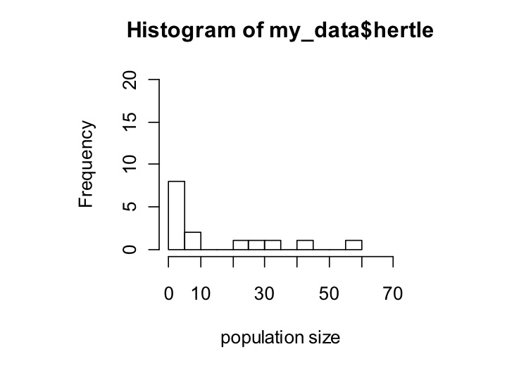
Here is a histogram:
hist(my_data$hertle,xlab=’population size’,ylim=c(0,20),xlim=c(0,70),breaks=10)
The parameters of hist shown here are the data, the x-axis label (xlab), the minimum and maximum that the y-axis shows (ylim), the minimum and maximum that the x-axis shows (xlim), and how many different bars I want the data broken into (breaks). Note that ylim and xlim both take in vectors of length 2, which I assign within the hist command using c().
It was important to specify ylim and xlim so that when we call the same command for gertie, the data are shown within the same range. In a later post, we’ll use a plotting package that takes care of all of that for you.
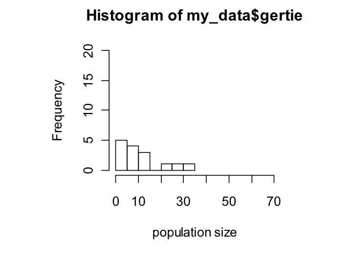
Here’s the same thing for gertie:
hist(gertie,xlab=’population size’,ylim=c(0,20),xlim=c(0,70),breaks=10)
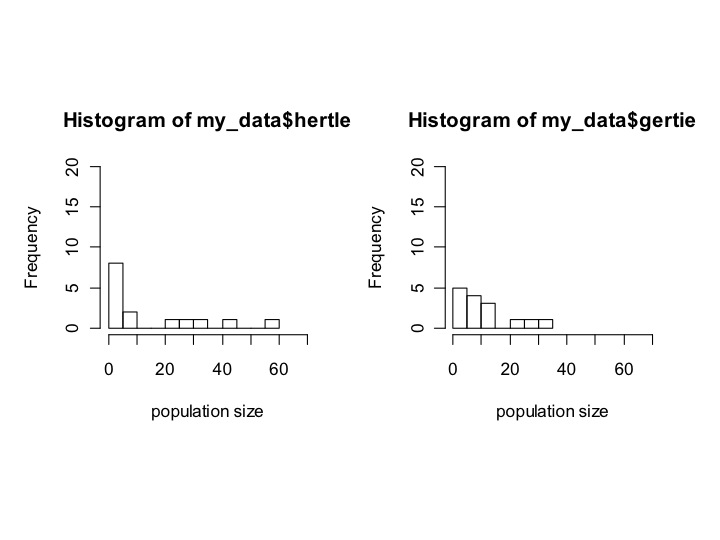
Now, it would be nice to have both plots show simultaneously. To do that, we’ll first have to tell R that when we plot, we want to plot 2 things. I’m not going to go into the details of the command that does this, except to show you how to say how many rows and columns of plots we want. We use the command:
par(mfrow = c(1,2))
which tells R to make 1 row and 2 columns. In other words, it reads it like this:
par(mfrow= c(num_rows,num_columns))
If we do:
par(mfrow=c(1,2))
hist(my_data$hertle,xlab=’population size’,ylim=c(0,20),xlim=c(0,70),breaks=10)
hist(gertie,xlab=’population size’,ylim=c(0,20),xlim=c(0,70),breaks=10)
We should see:
Now it’s easy to see that hertle has a longer tail, but mostly has tiny population sizes, whereas gertie has fewer tiny population sizes but also a less extreme tail.
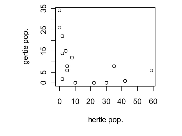
Ok, now let’s get into the meat of our data. We know that hertle is a better competitor than gertie, do their populations negatively correlate? To look at this, we’ll use the plot() command, and plot hertle vs. Gertie.
plot(my_data$hertle,my_data$gertie,xlab=’hertle pop.’,ylab=’gertie pop.’)
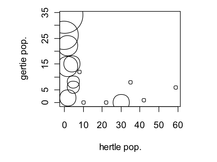
Yes, in fact they only seem to exist where the other isn’t. Let’s see if the pappamaw—gertie’s alternative food source, has an effect on this. To examine this, we are going to set the size of the dot to vary depending on the population size of pappamaw. Changing the size of the dot is done using the cex parameter in plot commands, like so:
plot(my_data$hertle,my_data$gertie,xlab=’hertle pop.’,ylab=’gertie pop.’,cex=my_data$pappamaw+1)
Wow! In fact, the gertie population is only substantial where pappamaw has populations, with one exception. Notice that I did cex = pappamaw + 1; this is because in some locations pappamaw has a population size of zero. Setting cex = 0 will make the dot be of size zero.
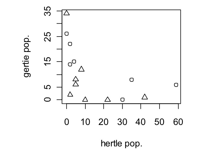
We might also want the shape of the dot to change depending on whether the environment is grassland or a streambed. This is just as easy as changing dot size. Instead of cex, we’ll use pch. However, we also have to make env_type, which is currently set as a factor, a number for plotting, because pch is expecting integers. This is easy to do, we just wrap my_data$env_type in the command as.numeric(), which forces my_data$env_type to be numbers. Note that this does not actually change your data frame, it is just a temporary change that only occurs within your plot.
plot(my_data$hertle,my_data$gertie,xlab=’hertle pop.’,ylab=’gertie pop.’,pch=as.numeric(my_data$env_type))
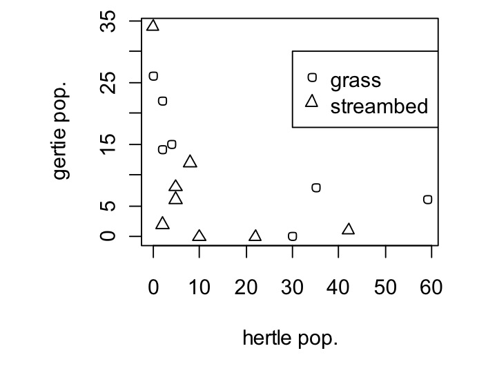
Well, that worked, but what are the different shapes? We’ll need to add a legend for that. Legends are added as a second command after the plot command. They work by doing legend(x,y,thing_,thing_labels). The parameters are the location you want the legend at (x and y), what you want to show in the legend (here, we want to show the two first shapes, or pch=c(1,2)), and what we want to label those shapes as (here, c(‘grass’,’stream’)).
legend(30,30,pch=c(1,2),c(‘grass’,’streambed’))
Remember, you can type in ?legend to ask for help and learn way more about what you can do with legends.
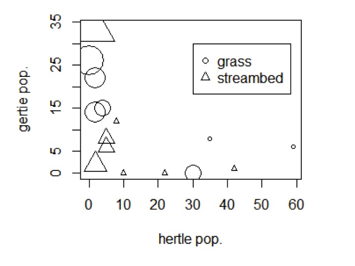
Finally, let’s combine the size and the shapes to see how all four of our variables change together.
plot(my_data$hertle,my_data$gertie,xlab=’hertle pop.’,ylab=’gertie pop.’,cex=(my_data$pappamaw+1)/1.5,pch=as.numeric(my_data$env_type))
legend(30,30,pch=c(1,2),c(‘grass’,’streambed’))
That’s one way to put all of that data in one plot!
Okay, so in this post we went through making a new type of R object, a data.frame, we learned how to access data within a dataframe, and we learned how to plot boxplots, histograms, and scatterplots, as well as how to modify dot shape and size within the scatterplot, and add a legend. As usual, I recommend using ?command to look into details of whatever command you are using.
Next time, we’ll learn how to load datasets—from files, from some of the standard ones provided by R, and then we’ll also install a new package and remake plots like these in a much more efficient (and pretty) way, using ggplot2.
Please let me know if there is anything in particular you would like to see in these posts in the future!
You made it to the end—nice work! If you’re the kind of scientist who likes figuring things out without wasting half a day on trial and error, you’ll love our newsletter. Get 3 quick reads a week, packed with hard-won lab wisdom. Join FREE here.

