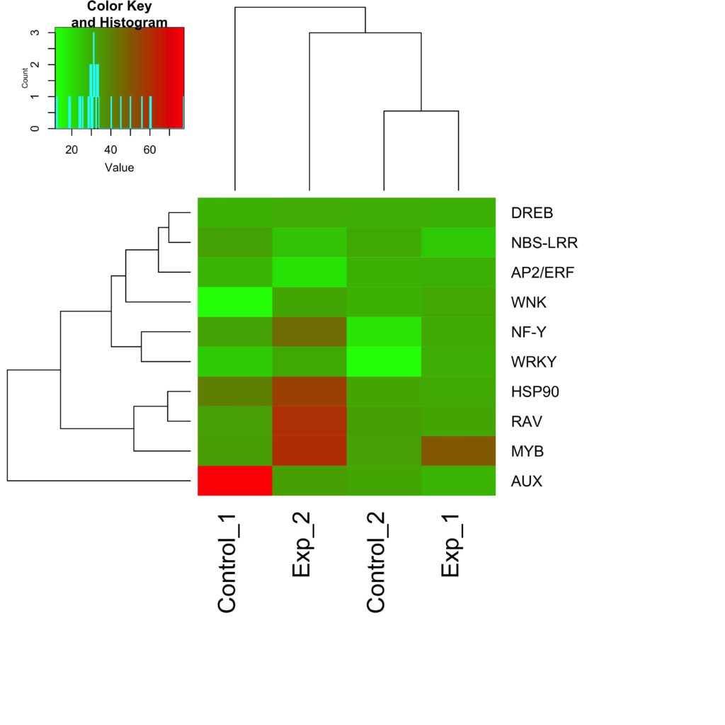
Have RNA-seq or microarray data? What possible tools can help you find your genes of interest? Is there any pattern in your expression data? I know you are totally at sea but heat maps are now commonly used to help. A heat map is a well-received approach to illustrate gene expression data. It is an impressive visual exhibit that addresses explosive amounts of NGS data. It’s packed with closely set patches in shades of colors, pomping the gene expression data of multifarious high-throughput tryouts.
In this article, I will help you find your footing in the basics of heat maps, followed by a gently paced introduction to the need for clustering such data. I encourage you to take a tour of the cardinal Bioinformatics resources listed below and that will help you out in generating your first heat map.
Tiles of a Heat Map
The individual tiles or rectangles in a heat map are scaled with a range of colors proportionate to gene expression values. The outcome makes a pitch to check upon the rows, columns, and joint structural patterns. It’s a tool used widely by the statisticians and bioinformatics scientists to make sense of large multi-dimensional datasets. It helps one to pry out groups among the genes and the samples handled by setting up associations.
The gene sequences correspond to the rows of the matrix and the chips/samples correspond to the columns. A colored matrix display represents the matrix of values as a grid; the number of rows is equal to the number of genes being analyzed, and the number of columns is equal to the number of chips. The boxes of the grid are colored according to the numerical value in the corresponding matrix cell. Genes are represented in rows of the matrix and chips/samples in the columns. What you get is a framework in a color matrix. This will look like a grid of boxes, colored to the gene expression values.
Enjoying this article? Get hard-won lab wisdom like this delivered to your inbox 3x a week.

Join over 65,000 fellow researchers saving time, reducing stress, and seeing their experiments succeed. Unsubscribe anytime.
Next issue goes out tomorrow; don’t miss it.
You will be able to pick genes based on their expression levels under different conditions. Many do not change, either because they are not on or are need to be on all the time. Those that do change are of the most interest. These represent the signature tune of gene expression affiliated to a particular condition. Below, I show you a theoretical gene expression dataset.

Clustering Tiles in a Heat Map
How can you see patterns with such data? The answer is to cluster the tiles. This involves a meaningful reordering of the rows and columns, which is a big challenge. The only way to comprehend the patterns and associations, is to bring the similar rows and columns nearer to each other in the plot. This step, referred to as re-ordering, is similar to a Rubik’s cube game. Reordering delivers two vital bits of information. First, as I said earlier, it reveals patterns among the rows and columns. Second, it exposes genes with the same expression profile. There are many strategies to cluster the data sets. However, hierarchical clustering is the most common heat map tool, and also generates a dendrogram to the side of the plot.
Bioinformatics Resources
Lots of actions polish off the heat map, such as delving and decoding the results productively. You may have to search, refine the values/labels, fix up rows and columns in the desired order, cluster the heat map, and freely steer around – starting with the raw data up to the heat map results. Do prepare the data in the needed format to perform the analysis. Sometimes, a few tools allow you to browse the data and get the results exported to reports, tables and figures. I recommend using the databases and tools listed below.
Databases
Online Tools
- CIMminer
- HeatmapGenerator
- MultiExperiment Viewer
- Bioconductor
- Morpheus
- MeV
- GenePatterns
- ExpressionProfiler
- geWorkbench
- DAVID
- Babelomics
- GoMiner
- ConceptGen
- GSEA
- EXPANDER
- ClustVis
Draw Your First Heat Map
Step 1. Visit ClustVis tool online
Step 2. Select Data import and click Load sample data
Step 3. Choose the dataset out of those in the list (I chose Iris flowers dataset)
Step 4. Click Heat map option
Ta-dah! That’s it. You guys made it.

Now, here’s a task waiting for you. Please examine the heat map created above and do post your interpretations.
To an amateur it may seem a cakewalk, but there are wheels within wheels. The complexity lies in clustering the input data and the range of colors that lay open. If you are to interpret the revelation of genes in a specific context, you should take your time to learn the whole nine yards of the heat map.
That’s all I got for now folks. I will try to bring on more in my next post. Until then, keep learning. Good luck.
Further Reading
1. Metsalu, T. and Vilo, J. (2015). ClustVis: a web tool for visualizing clustering of multivariate data using Principal Component Analysis and heatmap. Nucleic Acids Research. 43: W566-W570.
2. Khomtchouk, B.B., Van Booven, D.J. and Wahlestedt, C. (2014). HeatmapGenerator: high performance RNAseq and microarray visualization software suite to examine differential gene expression levels using an R and C++ hybrid computational pipeline. Source Code for Biology and Medicine, 9: 30.
You made it to the end—nice work! If you’re the kind of scientist who likes figuring things out without wasting half a day on trial and error, you’ll love our newsletter. Get 3 quick reads a week, packed with hard-won lab wisdom. Join FREE here.


