There are those of us who began our careers literally in the dark. Yes, there was a time and not that long ago, that all figures had to be on film. Slide presentations were slides. Micrographs were, well, micrographs on film. Figure creation involved several steps: figures for publications had to be mocked up; then photographed using film cameras and copy stands. As an electron microscopy trainee, a significant component of our coursework was learning photography and darkroom wizardry. The hours were laborious and the chemicals noxious, even with automatic developers. As scientists, we had to think ahead about how our data would eventually look in print, major considerations dealt with figure design, data inclusion and labeling.
Having grown up in an era of photography, I have learned a few valuable lessons in the art and science of figure creation I’d like to share. I learned many of these lessons from the school of “just one tiny change”, otherwise known as the Farquhar-Palade Lab. After my first experience with figures for a paper, I decided to count how many draft versions of the next figure I’d produced before it was sent for publication. From initial draft to the final version, I counted 47 different iterations and this is probably not a record for the lab either. On the positive side, the work we produced for these publications will stand as models and guides for what publication figures should contain, how they should look and how they contribute to the science of a manuscript.
Consider Resolution First
Resolution is a common topic for articles in this vein, but the importance of initial resolution in figure creation cannot be underscored enough. The cliché garbage in = garbage out really does apply here. Do use the highest resolution—I start at 600 dpi—to build your draft mockups. This principle applies to graphs or images. Switch your Prism or Excel graphs into an imaging program first, do not detour through PowerPoint. The majority of journals want high-resolution .pdf or .jpg files, so starting your work in low-resolution formats will result in pixelated and questionable figures. I will hammer this principle again and again throughout this article; think BIG (i.e., high resolution first here) to end up small, as in print.
Use Your Space Wisely for Figure Creation
Based on figures from published papers or from my editing pile, I often wonder if the open white areas in them represent the vacuum of space. Space is a precious thing in publishing. Page sizes and column widths are constrained, so using all of it for your data will actually highlight the results.
First, put all relevant data together in one draft figure. Next, design the physical layout for your figure, thinking ahead of how much space this figure will occupy in your manuscript. Size graphs the same if placed side-by-side and crop all unnecessary space. Leave no dead space. Really, if your highest data point is 50, with a 10 point error bar, then your graph doesn’t need to end at 100. Crop it. Move your bars closer together on the x-axis, reducing the width dimension. Then, you can resize it larger. Push those guys together as close as practical. Use all your defined space.
Images should be sized to reflect maximal data but be creative in using space. They do not all have to be squares of a certain size. If you need to make one image very big to display your data, try cutting out a corner without valuable data and pasting the next one smaller on a corner. Fill in your gaps and leave minimal white space. You will be amazed how much more data you have displayed when you use your space creatively.
BIG data is readable data. More data creates a stronger story.
Match Magnifications
Magnification is not enlargement. Again, this is a common theme in figure creation articles, but still a not very well understood principle. When you are at the point of figure design, you are way beyond the point of magnification consideration. Magnification is a better topic for a whole article, so I will just say, take ranges of magnification or be sorry later, i.e. here at this step.
One of my pet peeves when viewing images in figures is an obvious mismatch on magnifications with equal mag bars. If images are sized the same, say 2×2 in a figure, and represent two different conditions, then the same magnification should be used and the same size mag bar is legitimate. Taking one 20x image and manually enlarging it to have it look like the glorious 40x image is not the same.
Yes, you can take that lovely 63x image, size it at 4×4 to show a large area and then put a smaller 1×1 control image cropped, not shrunken, at the same 63x magnification. You can put it in the corner to show no effect for your control sample. That may be a good approach to maximize data demonstration and still save space.
Think BIG on data, small on the control.
Show More Than One Cell; Enlarge Your Object of Interest
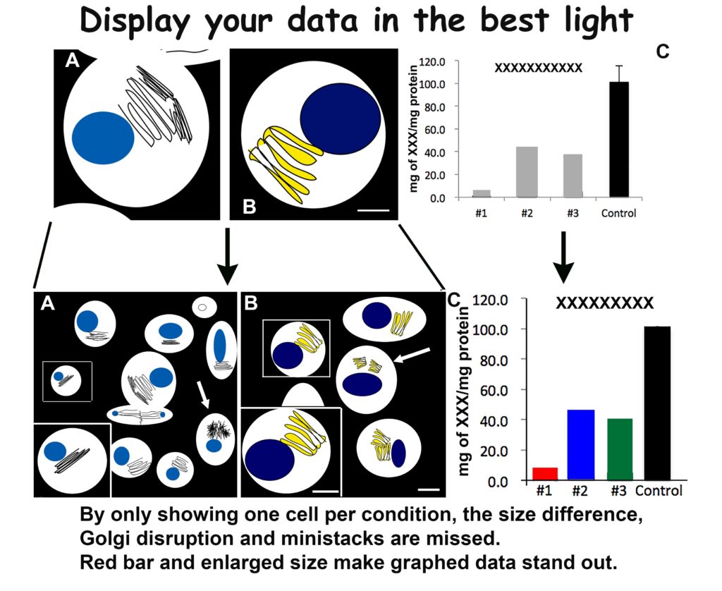
This principle harkens back to both space and magnification issues. You will have space to include a low magnification—but still high resolution—image for each of your samples by following my creativity guidelines. Show more cells! One perfect cell may have all your data, but several will have a powerful effect. This applies to light microscopy as well as electron microscopy.
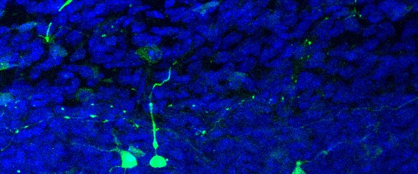
Your figures will have more impact with more data. As example, use a 20x image to show a field of 10 cells, with the majority having fluorescent Golgi at 4×4. Then take your lovely 63x Golgi labeled cell, crop as small as possible at as high of resolution as possible—800-1200 dpi. Resize this lovely piece of data to fit on top of your 20x in a corner. There you have two appropriately sized, high resolution and known magnification images in your figure. A great example of this is shown below.
By enlarging (making BIGGER) you create a more powerful figure with twice the data using the same footprint.
Use Large Bold Text and Abbreviations for Labels
As a reader, I want to judge the science based on the data, both written and displayed. When figure labels start in one corner on figure 1 but drift to the bottom on figure 4, my attention to their data suffers. Readable figures are consistent with labeling. And more importantly, these labels use bold text fonts, as large a size as is practical, abbreviations to save space when possible and are placed in a consistent manner to keep the reader on track, not wasting time trying to find a magnifying glass to read tiny print. Fine print is for legal documents, not scientific journals. Consider the final size you envision this figure will be in the journal layout and plan accordingly.
BIGGER BOLDER is more impactful than smaller and fainter.
Label Areas of Interest
I was reading a paper in Science the other day but when I reached Figure 1 in the text, I was left deserted. What was I supposed to see? Foci? Besides being just one purple blob (see above) with poor contrast, I really had NO idea what data I was supposed to see. Was it the tiny red dot or was the shape of the purple blob the data? Besides just being postage stamps, I really had no orientation or point of focus to interpret this data.
To avoid this, use arrows, boxes or something to draw the reader to your point of interest and provide context by outlining cells, delineating tissue orientation and use strong colors like red or black for your important samples on a graph. You want your data to be the centerpiece of all your work. Highlight and display it with BIG arrows.
Be proud and bold. Draw your reader in.
Doing bench research is hard. Endless repetitions of assays, long hours on the microscope and mind numbing lengthy PowerPoint presentations have drained creativity from modern science. We can put so much more data in each paper compared to the days we had to literally cut, paste, photograph and print each figure. Print publication is slowly dying and cyberspace allows us to overload manuscripts with visual data. I’m all in favor of using as much data as needed to complete your story, just consider the possibility that the data your paper is supporting is the key to acceptance. Keep that in mind during your figure creation.
We all want to think our science is BIG news not small potatoes.
You made it to the end—nice work! If you’re the kind of scientist who likes figuring things out without wasting half a day on trial and error, you’ll love our newsletter. Get 3 quick reads a week, packed with hard-won lab wisdom. Join FREE here.
Put this article into practice
Choose a free resource to help you move forward
POSTER
Histological Stains Poster
POSTER
Immunofluorescence Troubleshooting Guide
