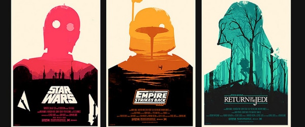
At a conference, a scientific research poster can be a great tool for drawing people into a conversation. Posters are a great way to show off your hard work, especially if you’re just starting out in scientific research. They can be perfect ice-breakers and they also allow you to get some really useful feedback from a completely different perspective.
Presenting your work is generally much less daunting in the one-to-one and small group situations provided by poster presentations, and they give you a chance to gauge your audience’s reaction in closer quarters.
But, there are some definite do’s and don’ts to bear in mind when designing your scientific research poster. We’ve pulled together our top tips on poster presentations to help you avoid any poster pitfalls!
10 Tips for Creating Scientific Research Posters
1. Choose Your Content Wisely
The information you can get across on a scientific research poster is very limited. Choose a single aspect of your research that you think you can explain fully in a small amount of text and graphics and focus on that alone. Keep it simple!
2. Use a Program Designed for Poster Layout
Most people use PowerPoint because they already have it, know how to use it, have a template from another person in their lab, etc. – but there are lots of other programs out there that are specifically for design layout and that will give you better results if you’re willing to invest a little time in learning how to use them, e.g. LaTeX.
Choose a layout that fits the space allocated to you by the poster session organizer.
3. Make Your Layout Flow
The flow of your poster should be natural and obvious to the reader. Eposters.net has lots of posters that were deposited there by their authors. Take a look at them (especially the award-winning ones) and work out the types of layout that you think work well. You could also deposit your finished poster on the site for others to see.
4. Avoid the Classic Mistakes
- Don’t use color schemes that are bold or garish. Stick to a couple of neutral tones and use an accent color (sparingly!) to highlight the detail.
- Don’t use more than two font types.
- Don’t use ALL CAPITAL LETTERS.
- Don’t use ridiculous fonts, like Comic Sans.
5. Get the Title Right
Passersby will look at the title first, so make it as interesting and informative as possible. Use a font that can be read from 10–15 feet away. A font size of around 60–90 point should suffice.
6. Make Your Poster Visually Appealing
Your brilliant title has drawn the attention of the passerby. Now, the passerby thinks, “How long will it take me to read this thing?” To keep their interest, make sure your scientific research poster mainly uses figures to tell your story – and avoids large blocks of text.
Make your figures visually appealing and self-explanatory. Your passerby will lose interest if they have to read a lot of text to work out what each figure represents.
7. Edit Your Text. Then Go Back and Edit It Again
On a poster, text is the enemy. People need to get into your story quickly or they will walk away, so work hard to have as little text as possible. (But make sure that all images and graphics that you’ve chosen are relevant.) Write the text and then go over it again (and again). Remove anything that isn’t completely necessary. If you must have text, keep your sentences short and use bullet points.
8. Leave Some Space
Don’t cram your poster full of information. Blank space makes the poster seem less complicated and more approachable, which helps attract people to your poster. You can use blank space to accentuate important parts of the poster (e.g. the conclusion). Less is more, as they say.
9. Get Feedback on Your Poster
Ask a friend to look at your poster before you print it, preferably a scientist who isn’t familiar with the exact subject area. Take on board their comments about the poster’s readability and overall appeal.
Also, make sure you print a test version of your poster; sometimes everything looks absolutely fine on your computer screen, but when it’s printed, colors might look brighter and things might move about. It’s better to find these things out before you go to the A0 printer, so make sure you print an A3 or A4 test page – it’s much easier to spot mistakes on a hard copy!
10. Stay at Your Poster and Talk to People
There’s no point making a great poster and then standing in the bar during the poster session. Stay with your poster and offer to talk people through it. Don’t miss this great networking opportunity.
If you’re at a conference where you leave your poster up outside the session, then put your email address on your poster and/or pin your business cards (if you have them) to the poster board. This will allow people to catch up with you later if you’re not around.
If you found this helpful, make sure to check out our free course on ‘Effective Science Communication,’ which includes a session on ‘How To Fix Your Horrible, Terrible, Ugly Conference Poster’.
For more on how to make a visually appealing poster, check out this video on ‘8 Ways to Create a Powerful Research Poster’.
Originally published October 23, 2007. Reviewed and updated January 2021.


