Are you tired of staring at all of your sequence data? Want to know the easiest way to look at it? For complex genomics data, an appropriate visualization tool is a must have. The right genomics software will make it easy-peasy to get some results as well as test all those ideas you have. Since the birth of genome-sequencing until today, there has been a parallel evolution in visualization methods using genomics software. They are now more colorful with the superior image display. Below, I discuss the utility of various visualization tools, according to different categories of research generally used in genomics and systems biology. In addition, I suggest three peerless, first-rated tools in each category.
Genome Browsers:
A genome browser is a graphical user interface to interactively view genomic data once it has been assembled and released. These genomics software programs are free for public access and consist of various tools to search, view, combine, and analyze genomic data creating a condensed graphical outlook. A genome browser details the location of known genes, and the kinds of functions each gene encodes. It combines various genome data to shed light on SNPs, ESTs, and conserved sequence patterns. It allows genes to be sorted according to similar expression profiles. You can even upload your own data for a specific gene and reference organism to share with other users. With a consistent interface like this, genome users can rally round to help build a useful platform.
Here are my favorites:
Genome Alignment and Assembly:
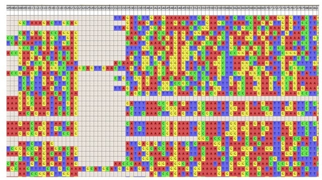
One of the most basic and incessant research routines is performing a multiple sequence alignment of nucleotide or protein sequence for a variety of reasons. ClustalW/ClustalX, MUSCLE, and T-COFFEE are basic tools to machinate visualization schemes based on vertical stacks showing strings when sequences align. In my experience, playing around with the alignment output is fun. For instance, a conservation plot is a very frequent manifestation that can be tinkered with using discrete colors. While multiple alignments are straightforward for short sequences, aligning big genomic data is much harder. In whole genome sequencing projects, putting sequences in the correct order is time consuming. Unfortunately, you can’t avoid doing this. To start, you need to remove matches that create inconsistencies in your data. Obviously, you need a faithful tool that’s going to help reduce your headache.
A genome visualizer aids the user with assessing and testing assembled genomes. It grants you access to observe and interact with the analysis results generated, inclusive of base modifications, motifs, and cDNA sequences. As a user, you can actually zoom in, edit, and trace data of interest within the long stretch of assembled contigs. It’s very obvious that the output of an assembly program produces toss-ups, owing to repeats, contiguous coverage limits, and read length. In such cases, cut to chase by carrying on a simple manual inspection to close gaps, rectify misassemblies, and uncover the chance error of concurrent bases, as this approach always caters to filtering of the displayed data.
You can try out these ones:
Comparative Genomics:
When it comes to heterogeneous genome data, you have to play the heavy. Comparing genomes at multiple scales, tailored to one’s desires, is now a successful endeavor enabled by integrating a myriad of new tools and techniques. There is lots of promise in using these genomics softare tools for research on the evolution of distinct genomes, large scale rearrangements, and reference based genome assembly. Exploring multiple regions of the genome, laying down all the paralogs and orthologs, genome alignments between and within species, and other navigation, facilitates an interactive inspection of multidimensional data. Furthermore, things like synteny exploration of two or more genomes and progressing from global to local views, are of the utmost importance. You can then depict the results graphically at the micro and macro level. Also, you have options to depict results at the whole genome level using a dot plot, ideogram, or as represented by a circle containing ribbons to reveal the association of genomic pieces on the basis of their location and orientation.
My choices:
How Do You Know Which Genomics Software to Use?
It all depends on what is needed to transform a huge formatted data file into a logical and worthy picture. I suggest the user keep in mind that the prime intention is to deliver meaningful data by resolving big data problems. My advice would be to find the most fitting tool, but do start with the basic and standard tools. The point is to highlight and spot meaningful connections that make sense by virtue of suitable visualization of genomic data. So far, the excitement in genome visualization has gone far, and the trend is now set at its highest. What’s next? Be prepared to jet-set for the most apt visualization technique for interpretation of your stupendous data.