Heat maps are a useful way to represent certain types of data; the data are colored by coloring according to the values in them, (e.g. red for high values, yellow for medium and green for low values), providing a powerful visual representation of a data set.
This allows you to quickly see results from DNA microarrays and all sort of other things. But, unfortunately, Excel’s abilities for handling a heat map like this are limited to say the least.
But the next item in my toolbox, ASAP Utilities, fixes all of that. ASAP utilities, available as a free downloadable trial, allows you to do many new tricks with your data that you couldn’t otherwise do using the standard set of Excel tools that come in the shrinkwrapped Excel package.
For example, after having color-coded a set of samples in your spreadsheet, you discover that you cannot search for or sort any of the samples based on your color designations.
Instead, you must somehow invent some other labeling scheme, such as numerical coding, and recode the rows by adding each number to an adjacent cell. Only then can you sort the rows by the numbers in the adjacent column. What a pain!
This is just one of those essential features that was annoyingly neglected in Excel. But not any more! Now, using the ASAP add-in, you can easily sort your data by cell color! Here’s how:
Simply make a selection of a range of cells to be sorted, click on the newly added “ASAP Utilities” drop-down menu incthe menu bar, select 5.Range > 2.Advanced sorting… and thencchoose to “sort by” Cell Color. That’s it! End of story.
Another useful feature of ASAP is that it allows you to import various file types directly into and export selected portions of your spreadsheet without having to do the “file, save as, rename, edit, save” shuffle.
In fact, you can even create a snapshot of your selected cells by exporting them directly as a *.gif or *.jpg image file as I’ve done here for my colored heatmap.
To do this, select your cells, click on “ASAP Utilities”, pick 17.Export > 1.Export selection or active sheet as new file. Click on the tab labeled “Export chart or range as image”. Click the radio button for your choice of format (Choosy mothers choose GIF), and Viola!
No more mouse-mouse-mouse to get to that buried directory either, since you can save to the same directory automatically.
And the final cool thing you can do with ASAP is launch the calculator or notepad from within Excel.
ASAP is just one entry in a list of some of the best MS Excel add-ins available complied by the editors of PC Magazine. The this list includes a set of 300+ drop-down menu items that were (intentionally) left out when the Excel developers finalized their requirements.
Well, Bon Appetit!… or whatever the equivalent is for munching this tidbit of fresh bites.
If you know of any other nice add-ins useful for biologists, please let us know. We’re always hungry!
You made it to the end—nice work! If you’re the kind of scientist who likes figuring things out without wasting half a day on trial and error, you’ll love our newsletter. Get 3 quick reads a week, packed with hard-won lab wisdom. Join FREE here.
Put this article into practice
Choose a free resource to help you move forward
DIGITAL TOOL
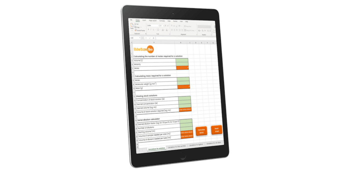
Lab Math Calculator
CHEAT SHEET
Lab Math Cheat Sheet


